GLOBAL EXPERTISE,
BOUTIQUE PRECISION

We are a full-scale manufacturer delivering end-to-end packaging — combining global production capacity with boutique-level craftsmanship. Every step, from structural design to printing, finishing, and assembly, is handled entirely in-house.

EXPLORE BY
INDUSTRIES

EXPLORE BY
PRODUCT TYPES

HOW WE DELIVER

We manage every stage – from concept to production and delivery.

Design & Engineering

Custom dielines, material selection, and print-ready prototypes

Quality & Sustainability

FSC®-certified control at every stage.

Printing & Finishing

High-end offset + foil, emboss, and soft-touch options.

Logistics & Delivery

20–25 day turnaround with global export capability.

GLOBAL REACH,RELIABLE EXPORT

We export packaging everywhere – from small custom runs to full-scale production. With a single-source facility and seamless land, sea, and air logistics, we deliver reliably across North America and Europe.

THE PARTNER BRANDS TRUST

Why brands around the world choose CBP.

CBP AT A GLANCE

Founded in

1989
Global heritage & long-standing manufacturing expertise

Full In-House

Manufacturing Model
Offset printing, die-cutting, foil stamping, UV lacquer, lamination, window patching

100M+

Cartons / Year Capacity
High-volume production with consistent quality

Global

Export Network
A global footprint across 27 countries and 5 continents, enabled by consistent and reliable land, sea, and air logistics.

12–20

Business Days Lead Time
Fast, predictable manufacturing cycles

BRC A Grade

& ISO + FSC® Certified
Comprehensive quality, safety & sustainability compliance

100K+

Kg Recycled Monthly
Sustainable production with continuous material recovery

125+

Specialized Team
Engineers & production experts driving custom solutions

60+

Clients Worldwide
Long-term global partnerships across multiple sectors

60+

Clients Worldwide
Reliable, efficient, customer-centered logistics performance

Trusted by industry leaders who share our passion for quality.

CUSTOMER STORIES &
EXPERIENCES

Discover how our clients rate their experience with our quality, service, and reliability.

Working directly with a true manufacturer made all the difference — the quality, precision, and control were on another level. Plus, their global certifications and sustainability practices gave us full confidence from day one.

European Skincare Brand

France

Their communication was flawless and every order arrived exactly when promised. Easily one of the smoothest vendor experiences we’ve had — and we’ve worked with both local and overseas suppliers.

Natural Foods Company

USA

They understood our brief instantly and delivered packaging that matched our vision down to the smallest detail. It’s rare to find a packaging partner that combines creativity with production-level expertise.

Boutique Wellness Brand

UK

It was our first time sourcing overseas, but their team guided us through every step with professionalism. The entire process felt effortless — and much faster than our past U.S. suppliers, who typically needed 6 to 12 weeks.

Personal Care Startup

California

FROM THE &
BLOG

Get the latest industry news.

Visual Hierarchy in Packaging: Positioning Your Logo, Text, and Imagery

Packaging is a form of communication. Before a consumer reads the ingredients, compares claims, or notices sustainability certifications, the box has already made a series of decisions for them—what to look at first, how to read the product, and in some cases, how to feel about the brand. That choreography is what designers call visual hierarchy, and in packaging it is not just a design tool; it is a commercial weapon.

Hierarchy Is Not Decoration—It’s Navigation

The most common misconception is that hierarchy exists to “make the package look nice.” In reality, its function is navigation. A consumer’s eye has milliseconds to decode: What is this brand? What product category is this? What variant or shade? What claim matters?

This sequence changes depending on channel. In a pharmacy aisle, a skincare product competes against dozens of SKUs for attention in less than two seconds. Online, that same product must read clearly in a thumbnail or be compelling in a still image for an influencer’s unboxing. One surface, two different reading logics.

Logo vs Category: Who Leads?

Across beauty, wellness, and lifestyle categories, hierarchy often begins with a tension between brand and category. Prestige skincare and fragrance brands tend to reduce the prominence of their logo, relying on typography, surface finishes, and whitespace to do the heavy lifting. The message is: “You know who we are; we don’t need to shout.”

Mass and D2C brands do the opposite. The logo is bolder, brighter, and more central because brand trust is still being built. For new or challenger brands, visibility is leverage—high logo prominence accelerates recognition.

Chocolate and gourmet products add a third nuance: storytelling. Here, logos often share hierarchy with imagery—cacao origin, praline textures, seasonal themes—because flavor and indulgence are semiotic drivers.

Typography as Structure, Not Style

Typography is hierarchy’s backbone. It determines how information is read and remembered. In packaging, typography must solve three simultaneous challenges:

  1. Identification: brand + category
  2. Differentiation: variant + shade + flavor
  3. Justification: claims + certifications + benefits

Problems arise when these layers collapse. If “SPF 50” or “vegan collagen” is the wrong size, hierarchy breaks. Claims must be visible enough to influence purchase, but not so dominant that they overshadow the brand. Luxury brands often reduce claim prominence to preserve mystique. Mass brands give claims volume because function sells.

Color as a Traffic System

Color is one of the fastest visual cues in packaging. Beauty and wellness brands use Pantone precision to differentiate SKUs (e.g., Hydration vs Retinol vs Vitamin C). Chocolate uses warmth for “indulgence,” pastel for “artisanal,” and deep blacks for “premium.” Pharma uses blues and whites for “clinical clarity.”

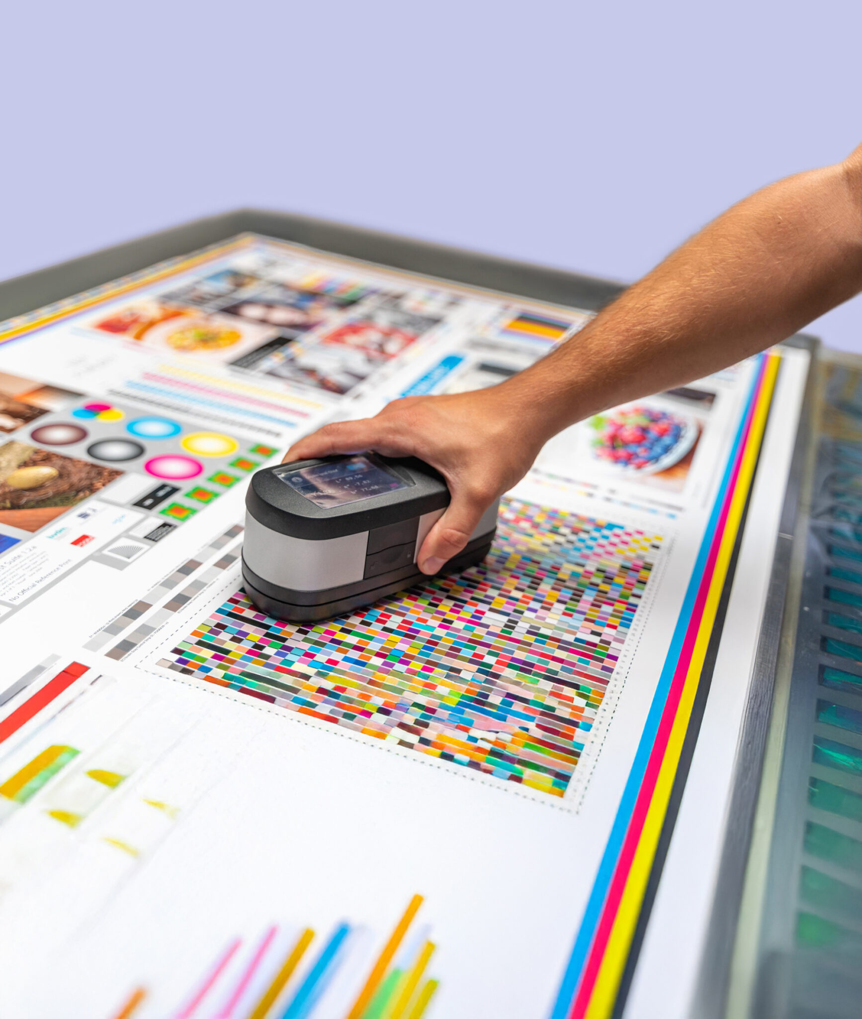
Color is also critical for digital readability. A design that works beautifully on shelf can collapse in a 1080×1080 feed if contrast is poor. This is why modern brands test packaging in two environments: shelf testing and screen testing. One speaks to retail, the other to D2C.

Imagery: The Supporting Actor

Imagery should clarify what the product is or what it does—not distract from it. In skincare, photography is rare; packaging relies instead on typography, texture, and finish. In chocolate and confectionery, imagery often becomes an appetite trigger. In beauty tools, imagery performs explanation—brushes, rollers, and tech devices benefit from visual demonstration.

The most successful packaging treats imagery like casting: give it a role and the shot works. Let it compete with the logo and the scene collapses.

Shelf vs Feed: Two Different Economies of Attention

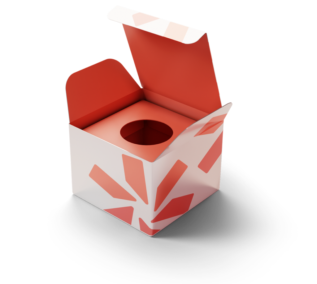
The rise of D2C and influencer marketing added a new variable: packaging is now designed for both shelf and feed. Shelf hierarchy prioritizes distance visibility and legibility. Feed hierarchy prioritizes tactile surfaces, color nuance, and unboxing sequences. Soft-touch and foil perform better on camera than gloss; interior printing makes unboxing posts more cinematic.

Beauty brands mastered this duality early, but chocolate, fragrance, and gifting categories are quickly following. The consumer journey has become hybrid—physical + digital—so hierarchy must anticipate both.

Hierarchy Is Strategy

Ultimately, visual hierarchy is strategy disguised as aesthetics. A carton that places brand first and claims second signals confidence. One that elevates claims signals functional value. One that elevates imagery signals indulgence or sensory storytelling.

The smartest brands are not the ones with the most expensive printing techniques, but the ones who understand what to emphasize—and what to intentionally whisper.

Packaging doesn’t just present the product; it introduces it. Hierarchy is the handshake.

Premium Finishes Explained: Foil, Embossing, Spot UV & More

When it comes to premium packaging, finishes are the silent persuaders. They don’t speak in slogans or bullet points; they speak through texture, reflectivity, and contrast. A luxury skincare box, a chocolate assortment, or a fragrance carton can look nearly identical in structure, yet feel worlds apart once finishes enter the scene. Understanding how finishes function—both aesthetically and psychologically—has become essential for brands competing in crowded categories.

Foil Stamping: The Currency of Visibility

Foil stamping is the oldest trick in the luxury playbook, but its longevity is not accidental. Human vision is wired to detect reflective surfaces. Foil doesn’t just shine; it catches attention faster than matte elements. In beauty and fragrance, silver and gold foil remain powerful signals of price and prestige. Chocolate and confectionery brands use it to communicate indulgence and craft. Even minimalist brands haven’t abandoned foil; they’re simply using it with more restraint—thin lines, micro-typography, or a logo rendered with surgical precision.

The sustainability conversation has pushed foil to evolve. Suppliers now offer recyclable foils and thinner gauge materials that perform the same visual magic with less environmental guilt. The result is foil that behaves less like decoration and more like typographic jewelry.

Embossing & Debossing: The Art of Tactility

Embossing and debossing are about elevation—but not just literally. Tactile finishes create trust and memory. When a consumer feels raised typography under their fingertips, the brain registers craftsmanship. It’s the same mechanism that makes hardcover books or leather goods feel more valuable than their cheaper alternatives.

In packaging, embossing has become the emblem of “quiet luxury.” The trend favors texture over spectacle: subtle brand marks, tone-on-tone borders, or ingredient callouts rendered with precision. Debossing, the inverse technique, works especially well with soft-touch coatings, creating a sensory contrast that invites touch.

Psychologically, tactile finishes slow the consumer down. A matte panel or raised logo forces the hand to pause—an effect extremely valuable in beauty and gifting categories where unboxing is ritualized.

Spot UV: Contrast as a Design Tool

Spot UV is the medium for brands that want both restraint and drama. It highlights isolated elements—logos, claims, or patterns—without overwhelming the entire surface. On matte cartons, Spot UV behaves almost like condensation, catching the light at certain angles and disappearing at others. This subtle shifting is why tech and skincare brands favor it; it feels modern, engineered, and efficient.

Spot UV also helps tier products within a portfolio. A brand can reserve Spot UV for its prestige line while keeping mass or entry SKUs matte. This creates a laddered effect without redesigning the packaging system.

Soft-Touch: The Rise of Sensory Minimalism

Soft-touch coatings are the finish of the decade. Their velvety matte surface instantly communicates premium quality. In beauty and wellness, soft-touch has become the tactile language of “clean luxury.” It photographs beautifully—an underrated advantage in the age of influencer marketing and D2C unboxing videos. Unlike foil or holographic films, soft-touch delivers luxury quietly, without shouting for attention.

But the appeal runs deeper. Soft-touch taps into the consumer’s sensory expectations for skincare and fragrance. If the product claims smoothness, hydration, or refinement, the box’s surface reinforces that narrative before the jar or bottle even appears.

Holographic Films: Youth, Energy, and Play

If soft-touch is the language of calm, holographic finishes are the language of play. They appeal to color, motion, and novelty—qualities that thrive on social media. Holographic films are staples in K-beauty, hair care, and youth-driven D2C brands. They photograph aggressively well; they scream “share me.”

What’s changing is not the existence of holographic finishes, but their execution. Instead of covering the entire carton, designers now apply holography surgically—perhaps a corner panel, a lid, or a tiny logo burst. The result is less club, more couture.

Finishes as Brand Strategy, Not Decoration

The biggest misconception about premium finishes is that they are ornamental. In reality, they are strategic tools. A finish can communicate:

  • Price tier
  • Formulation story
  • Ingredient positioning
  • Category norms
  • Target audience
  • Retail channel
  • Seasonal vs core SKUs

Finishes help brands design hierarchy: what should the eye see first? What should the hand feel? What should the consumer remember?

The 2025 Finish Landscape

The new era is defined by balance: tactile + minimal + recyclable. Soft-touch paired with embossing, foil paired with restraint, Spot UV paired with matte. Luxury no longer means maximal; it means intentional.

Premium finishes are not simply surface effects. They are how packaging speaks without words—how it conveys promise, price, and personality before the product even emerges from the box.