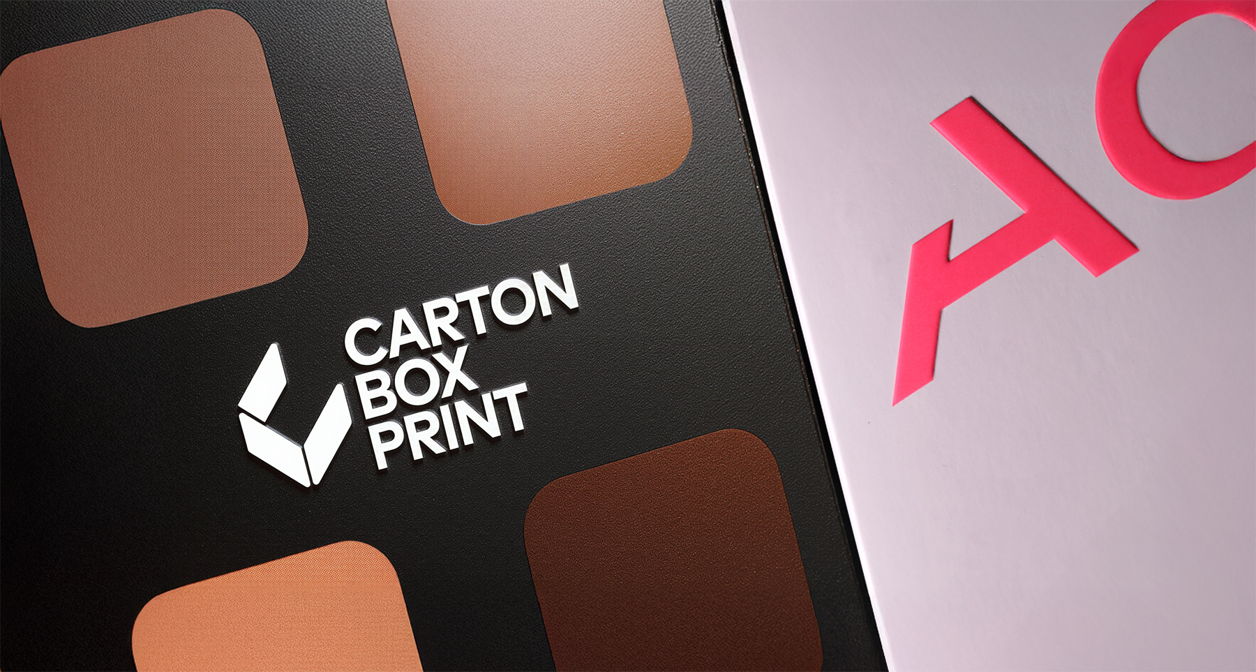
When it comes to premium packaging, finishes are the silent persuaders. They don’t speak in slogans or bullet points; they speak through texture, reflectivity, and contrast. A luxury skincare box, a chocolate assortment, or a fragrance carton can look nearly identical in structure, yet feel worlds apart once finishes enter the scene. Understanding how finishes function—both aesthetically and psychologically—has become essential for brands competing in crowded categories.
Foil Stamping: The Currency of Visibility
Foil stamping is the oldest trick in the luxury playbook, but its longevity is not accidental. Human vision is wired to detect reflective surfaces. Foil doesn’t just shine; it catches attention faster than matte elements. In beauty and fragrance, silver and gold foil remain powerful signals of price and prestige. Chocolate and confectionery brands use it to communicate indulgence and craft. Even minimalist brands haven’t abandoned foil; they’re simply using it with more restraint—thin lines, micro-typography, or a logo rendered with surgical precision.
The sustainability conversation has pushed foil to evolve. Suppliers now offer recyclable foils and thinner gauge materials that perform the same visual magic with less environmental guilt. The result is foil that behaves less like decoration and more like typographic jewelry.
Embossing & Debossing: The Art of Tactility
Embossing and debossing are about elevation—but not just literally. Tactile finishes create trust and memory. When a consumer feels raised typography under their fingertips, the brain registers craftsmanship. It’s the same mechanism that makes hardcover books or leather goods feel more valuable than their cheaper alternatives.
In packaging, embossing has become the emblem of “quiet luxury.” The trend favors texture over spectacle: subtle brand marks, tone-on-tone borders, or ingredient callouts rendered with precision. Debossing, the inverse technique, works especially well with soft-touch coatings, creating a sensory contrast that invites touch.
Psychologically, tactile finishes slow the consumer down. A matte panel or raised logo forces the hand to pause—an effect extremely valuable in beauty and gifting categories where unboxing is ritualized.
Spot UV: Contrast as a Design Tool
Spot UV is the medium for brands that want both restraint and drama. It highlights isolated elements—logos, claims, or patterns—without overwhelming the entire surface. On matte cartons, Spot UV behaves almost like condensation, catching the light at certain angles and disappearing at others. This subtle shifting is why tech and skincare brands favor it; it feels modern, engineered, and efficient.
Spot UV also helps tier products within a portfolio. A brand can reserve Spot UV for its prestige line while keeping mass or entry SKUs matte. This creates a laddered effect without redesigning the packaging system.
Soft-Touch: The Rise of Sensory Minimalism
Soft-touch coatings are the finish of the decade. Their velvety matte surface instantly communicates premium quality. In beauty and wellness, soft-touch has become the tactile language of “clean luxury.” It photographs beautifully—an underrated advantage in the age of influencer marketing and D2C unboxing videos. Unlike foil or holographic films, soft-touch delivers luxury quietly, without shouting for attention.
But the appeal runs deeper. Soft-touch taps into the consumer’s sensory expectations for skincare and fragrance. If the product claims smoothness, hydration, or refinement, the box’s surface reinforces that narrative before the jar or bottle even appears.
Holographic Films: Youth, Energy, and Play
If soft-touch is the language of calm, holographic finishes are the language of play. They appeal to color, motion, and novelty—qualities that thrive on social media. Holographic films are staples in K-beauty, hair care, and youth-driven D2C brands. They photograph aggressively well; they scream “share me.”
What’s changing is not the existence of holographic finishes, but their execution. Instead of covering the entire carton, designers now apply holography surgically—perhaps a corner panel, a lid, or a tiny logo burst. The result is less club, more couture.
Finishes as Brand Strategy, Not Decoration
The biggest misconception about premium finishes is that they are ornamental. In reality, they are strategic tools. A finish can communicate:
- Price tier
- Formulation story
- Ingredient positioning
- Category norms
- Target audience
- Retail channel
- Seasonal vs core SKUs
Finishes help brands design hierarchy: what should the eye see first? What should the hand feel? What should the consumer remember?
The 2025 Finish Landscape
The new era is defined by balance: tactile + minimal + recyclable. Soft-touch paired with embossing, foil paired with restraint, Spot UV paired with matte. Luxury no longer means maximal; it means intentional.
Premium finishes are not simply surface effects. They are how packaging speaks without words—how it conveys promise, price, and personality before the product even emerges from the box.

